
Which Kitchen Laminate Colors to Avoid according to Vastu?
The Indian kitchen is not just a cooking space; it’s a space for sustenance, vitality and prosperity. Ancient Indian architecture philosophy Vastu Shastra places monumental importance on planning, designing, and even painting the kitchen. Choosing the right kitchen laminate colours as per vastu can make a significant difference in positivity, happiness, and overall well-being in the home.
Though it’s easy to follow design trends or even personal preference, it is important to know that certain laminate colors can disturb the flow of energy in the kitchen. Let us steer clear of Vastu, which ones are auspicious, and how to achieve the perfect blend of looks and energy.
What is the Significance of Colour in Vastu for Kitchens?
Vastu connects each direction and element with a specific energy. The kitchen, being the fire zone, should be placed in the southeast direction, which is controlled by the fire element (Agni). Thus, the laminate colors used in the kitchen on walls, cabinets have to harmonize with this fiery energy and not conflict. Choosing the best kitchen laminate colour according to Vastu makes the room favorable for the well-being, mood, and prosperity of the family.
What Kitchen Laminate Colours to Avoid according to Vastu?
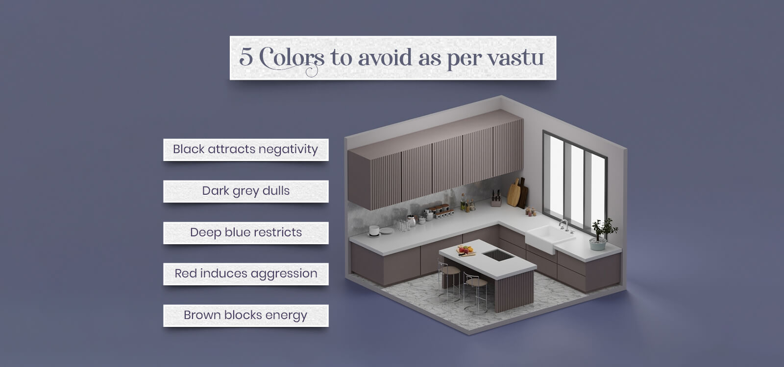
Below are the most avoided laminate colors that must be avoided from your kitchen to comply with Vastu:
1. Black – Absorbs Energy and Dumps Fire Eleme
Black is described as modern and trendy, Vastu highly recommends avoiding it in the kitchen. Black sucks up light and energy, which goes against the fire element that necessitates light and brightness. Don’t use black kitchen countertops or cabinets. If black has to be used in your design, combine it with white, cream, or red accentuations.
2. Blue – Represents Water, Which Contradicts Fire
Blue is a relaxing kitchen laminate colours as per vastu, yet it is associated with water, which is the direct opposite of fire in the kitchen. Plentiful use of blue in kitchen laminates, particularly in southeast- or south-facing kitchens, has the potential to create conflict and health out-of-balance. Steer clear of dark navy or royal blue laminate cabinets. Use blue for decor accents but not center-stage tops.
3. Grey – Representation of Negativity and Confusion
Grey shades, especially the darker ones, are dull or neutral in Vastu. Too much grey creates confusion, indecision, and sterileness in the kitchen environment. Prevent the use of whole grey cabinets or dull grey laminate finishes. If unavoidable, balance it with warmer colors like beige or light brown.
4. Dark Purple – Overwhelming and Unbalanced
Although pale lavender shades are calming, deep purples kitchen laminate colours are energetic and cause energetic dissonance in kitchens. They lead to anger and ill humor every time they are used excessively. Shun deep plum or wine-colored laminates.
5. Metallic Silver – Extremely Cold and Industrial
While metallic laminates are in vogue, Vastu does not recommend too much cold, reflective finishes in the kitchen, particularly in north or east directions. Silver shades can create a sterile or clinical atmosphere, which will diminish the warmth required in a kitchen. Shun heavy use of metallic silver kitchen laminate hues.
What are vastu approved and best kitchen laminate colours?
If you want the best kitchen laminate colours according to Vastu, go with the following shades:
- Red: Strengthens the fire element and is suitable for southeast kitchens. Red represents energy, passion, and excitement.
- Orange: Lively and stimulating, best utilized to continue to fuel enthusiasm and energy in the kitchen.
- Yellow: Symbolizes heat, nourishment, and light.
- Green: Conveys freshness and healing energy; optimal for north or northeast-oriented kitchens.
- Beige and Cream: These neutral colors provide a sense of balance and elegance in a kitchen.
- Brown or Wooden Textures: Grounding and stability are achieved with earthy tones making it perfect for cabinets and panels.
In selecting the best kitchen laminate colour for the kitchen as per Vastu, opt for matte or coarse-textured finishes rather than extremely glossy ones to evoke serenity and stability.
Royale Touche offers a wide range of Vastu-aligned laminate shades that combine aesthetics with traditional energy balance.
Frequently Asked Questions
1. What is the most popular color in laminate?
White, beige, and wood-grain laminates are the most sought after nowadays because they are versatile and ageless. Red and green are also catching on in Vastu-aware homes.
Royale Touche includes several of these shades in its modular kitchen laminate collections.
2. Which color laminate is the best?
According to Vastu, red, yellow, orange, and earthy wood tones are the ideal kitchen laminate colours choices. They correspond to the fire element and facilitate positive energy.
3. Which type of laminate is costly?
Acrylic and high-gloss laminates are costlier because of their rich finish and longevity. Digitally printed customized and metallic laminates also lie in the expensive end category.
4. What colors should be used with caution by Vastu?
Black, grey, blue, dark purple, and metallic silver should not be used as per Vastu in the kitchen. These colors either go against the fire element or bring about imbalance and heaviness to the space. Royale Touche experts can guide you in picking tones that are Vastu-compliant and visually harmonious.
5. Which color is not good for the kitchen?
Those that are related to water (such as blue), dullness (grey), or darkness (black) are unfavorable for the kitchen. They break the energetic equilibrium required in cooking and family sustenance areas.